Website is something that nowadays people visit more frequently than anything else. In a single day we run over several webpages we can’t even calculate. While trying to find a suitable website for a purpose people often choose a website with better UI. UI is something that determines how long a person will stick to a website. It has the power to manipulate the users to stick to a webpage. A user takes very less time to choose which website will they stay on, good UI/UX affects that choice and make a person stay longer and use a website.
In an UI the most determining element is VISUAL HIERARCHY. Visual hierarchy is one of the most important elements of an UI, an important step to maintain in Web Designing.
WHAT IS VISUAL HIERARCHY
We all know that visual satisfaction is the prime element of an UI. Basically the technique of providing this visual satisfaction is termed as Visual hierarchy. Visual hierarchy is the designing of a website most suitable for a user to scan. It basically helps to arrange or design the website in such a way that it becomes easier for a user to draw information from, or easy to scan.
Now the question arises is that how to organize the UI contents for a better visual hierarchy.
VISUAL HIERARCHY EFFECTIVE UI ORGANIZATION
There are few points that needs to be considered while organizing an UI to get better visual hierarchy
SIZE OF ELEMENTS
One of the most important things that influence visual hierarchy is the size of the elements. It is very important to wisely use the size of the elements to pull consumers towards your website. Like people first notice the texts and pictures which are bigger in size. So, properly arranging the size of the elements of the website is an effective way to develop visual hierarchy.
COLORS
This is another important element which plays a key role in determining the visual hierarchy of a website. The use of bright colors instead of dull colors attracts more people thus making your website successful. Thus proper use of colors must be considered while designing a website. People basically gets attracted towards the brighter colors first so the main important facts or the core idea may be written using very bright colors so as to move people’s attention towards that text at first.
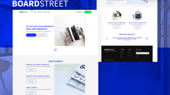
WEBSITE LAYOUT
It is very obvious that the layout of the website contributes greatly to visual hierarchy. When a person opens a webpage, it is very important for the person to be satisfied by the layout of the webpage. The layout must not be too messy or confusing it should be pretty basic and acceptable by common mass. The grids, alignment, the spacing between the elements, etc. facts must also be looked after. So the layout of the website must be taken under consideration while designing the webpage.
NEGATIVE SPACE
Clever use of space can also help in creating visual hierarchy. Often designer overlook or neglect the use of White space often called negative space, in websites, but it is seen that white space affect greatly to the appearance of the websites. It helps to highlight the components of the UI. For, example when a colored element is placed at a white space the element gets highlight. This unique quality of white space must be used in a clever and creative way to develop the visual hierarchy.
CONTRAST
Contrast is another very crucial element useful for the visual hierarchy. Contrast plays a great role in differentiating the elements of a website. When 2 elements of color having different contrast are even placed close, appears to be 2 different elements. Thus contrast is a useful item that must be used very carefully as it can also bring out adverse effects thus, contrast can bring out great results but only when used carefully and professionally.
THE DESIGN STYLE
It is seen that the design style of a website has huge effect on visual hierarchy as it compromises of a huge part of the visual part of a website. So, the design style determines a lot about how a user sees a website and affects it highly. Thus if used creatively then not only the design style will benefit your appearance but will also develop the visual hierarchy of the website.
OPTIMIZE SCANNING PATTERN
According to experts there are two ways in which a person generally scans a website “F” and “Z”. Generally in the websites having a lot of texts such as blogs, people use “F” technique i.e. the user first reads the upper most line and then slowly comes down making the lines shorter and shorter. And the “Z” pattern is used in websites having fewer texts, in that pattern the user generally read the upper part of the website starting from left upper corner till right upper corner then they come to the left lower corner directly and go through the lower line till right bottom corner like the letter Z. And it is also seen that mostly the user reads the upper and lower lines to understand the idea of the websites. Thus these patterns must be kept in mind of the Web Designers while designing the website. This is one of the most important detailing that has a huge effect on the visual hierarchy.
Typographic Hierarchy
It is seen by the experts that the visual hierarchy highly depends on the typography of a website. Thus, there is a sub division of visual hierarchy called typographic hierarchy, in which the proper way of arrangement of texts is given importance. This division mainly aims at organizing the text or the content in the best possible way to make it more acceptable for the user. Thus typography is an important part of visual hierarchy and must be used carefully.
Thus these are the most important parts that the designers must keep under consideration while designing a webpage. If these points or elements are kept in mind then it will highly benefit the visual hierarchy of a website thus making it highly successful and beneficial to its owner.