We are quite aware of the fact that in the present scenario we are completely dependent on the technology that we use that has modified our lifestyle, our choices, even ourselves in a drastic way. And it is quite interesting that the change didn’t take a long span of time. Not even decades a few years back only there were not as much technological choices as we have now. Technology has developed in a very short span of time at a huge rate and it is quite evident that it still is on its developing stages.
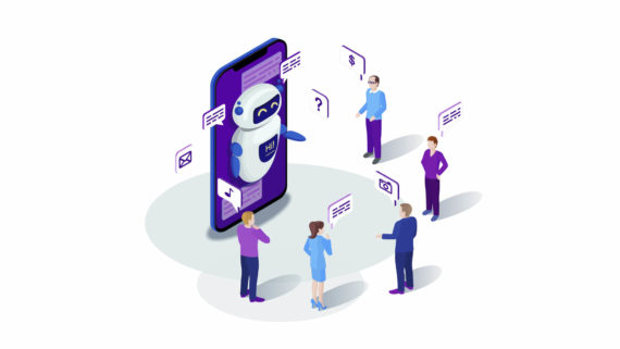
This generation is the age of information technology. And the people of this era are very much well acquainted with the drastic technological developments and its applications in the present scenario. And this is not only a general knowledge or thing to know, people nowadays are bound to know and accept the role and use of technology in the present world. And it has no doubt brought out great results in all aspects of the society. From shopping to ordering food, people no more move and go in search for it and compare the prices they can do it just by swiping and clicking their smartphones while sitting on a comfortable couch or lying in the bed without any efforts. And this market has no doubt grown almost in an exponential rate.
E-Commerce and virtual marketing are now general terms and necessities for every companies, businessmen and even small entrepreneurs. So, internet has basically become an alternative world for the human being and indeed they spend a huge amount of their time daily in internet. But internet is just a network actual element of this huge network are the websites. People no more require the introduction to websites. We go through billions sometimes even trillions of websites daily. Just today I googled “Web designing tricks” and 35,900,000 results came out in just 0.63 seconds. This is not a matter of joke. This much results and websites are not a joke.
So, it is quite evident that there are almost uncountable amount of websites presently in Internet. But when you search for something why some websites come at first, at top list? There must be some reason. The simple and basic reason behind is that relevance. All website are not similar on the basis of web design. The main thing behind this arrangement of website is that which ones are better, but why this comparison arises? the most important reason behind this arrangement is that some website have far better web-design than others, thus they are much more satisfying to the customers or users than other with weaker designs. So, the main element of a website is the web-design and, a website with strong web-design will be much more appealing to the users. And the users will be much more comfortable with the interface. But, web-designing steps are almost same the tools are also same then why this difference the answer is “ERRORS”. There are some mistakes that are very often done at the time of web-designing and that can hamper the website success rate drastically. So, what are these frequent errors that increase the bounce rate of the websites?
Well, the answer lies in some 5 small points on very frequent and basic mistakes in web-design that may have adverse effect on the users of the website.
So, let’s proceed to the points in order to keep your customers satisfied as well as make them come back to your website by a perfect error free web-design.
TOO MUCH INNOVATION
Yes, innovation indeed is important, but nothing should be done crossing the limits. Innovation is extremely important in the field of web-designing but, it is obvious that too much innovative stuff can make you website look alienated to users it may look complicated. Users might find it tough to use such a confusing and completely new interface. So, innovation must be in a planned and organized manner in order to achieve success or else too much innovation may make your website too much complicated for the users and thus they will not be able to understand it. So, to keep your bounce rates low this must be kept in mind, you must appreciate innovation but up to a certain limit at a time.
NO NEGATIVE SPACE
There was a time when people liked filled up website and a lot of stuffs kept together but, now we have arrived to a time when people have become much more result or goal oriented. They no more have fascination for highly filled space to draw their attention, rather now people like clean and well-arranged website having less and only required options. People no more like lots of elements kept together. So, with these increasing need of cleanliness and well-oriented website the need of Negative Space or White Space have also increased in a great way. But, still many web-designers hate to use it. But white space makes your elements of the website much more deeply highlighted and makes your website look clean and organized. And such appearance of website can highly affect and decrease the bounce-rate of the website thus helping the website to thrive to higher success. So, proper and definite use of White Space can highly benefit your website.
CONFUSING LENGTHY FORMS
Believe me, I hate to fill forms and I can bet most of the people fill the same. It is extremely unjust to make a consumer fill lengthy and confusing forms. And it also feels inappropriate to disturb the employees again and again for filling the forms. And I really hope and love places where the forms are not so troublesome. Well, people nowadays have no time to waste so, you must value their time and effort and make you forms highly understandable and as short as possible to make more and more people come to your website for your service and spend their valued time to help you reach to your success.
POOR NAVIGATION
I really like to spend some time on the websites I visit and hover over the website and navigate over its options, but sometimes I go through some websites where the navigation facilities are highly faulty and poor. And believe me I feel like never visiting that website, but on the other hand when I get a proper website with highly functional navigation I unknowingly spend a lot of time on those websites. So, it is undoubtedly extremely important to have a proper functional navigation to make your website comfortable and smooth for your users to use, thus increasing you success rate.
CONTRAST
Well, our senses are much more functional than we think. Do you ever wonder why do you unknowingly read bigger texts first? It’s because of contrast. Not color, not font, not anything else, but contrast. It may sound a bit odd but believe me; contrast can truly play a key role in customer satisfaction. People generally sense it that bigger texts are important and bigger and prominent buttons are the ones required. So, this hierarchy and proper organization is another key factor in web-designing. Using white space to highlight factors use of bright colors to emphasize something in comparison to other, in order to specify their importance. So, a user finds it really helpful and satisfying if the website understands its needs and sometimes emphasize the important parts without wasting any time and saving excess efforts by the use of this hero called contrast. But remember neglecting contrast is a very common mistake in web-design and such website fail to comprehend with the user’s needs. Thus, in order to keep you users happy and attract more mass you must follow these steps.
Well, it was those very common 5 mistakes that many web-designs contain and really irritates the users and thus increasing the bounce rate.
Now, that you know about what you should do and what you shouldn’t what are you waiting for? Go and work on your website’s web-design.