Internet and website: these are not just words they are our daily necessity. You will not find a single person who doesn’t use Internet and websites nowadays. Even kids use websites for various purposes. Almost all kind of work are nowadays done with the help of Internet.
In each and every device you can access Websites and Internet, irrespective of its size or type.
This accessibility of internet and websites on different devices has significantly increased the number of internet users.
It is quite obvious that opening a computer every time for doing something is troublesome but using a mobile for that purpose is something really helpful. So, this quality increased the number of users that resultantly increased the online population drastically. Now, each and every person uses the online network for various purposes through device of their choice. And to be honest people spend most of their time in browsing internet and websites nowadays. Frankly speaking I go through a huge number of websites daily for different reasons.
It has been seen in surveys that most of the internet users use mobiles and tablets rather than computers. That is the main reason behind the launching of the Mobile First principle.
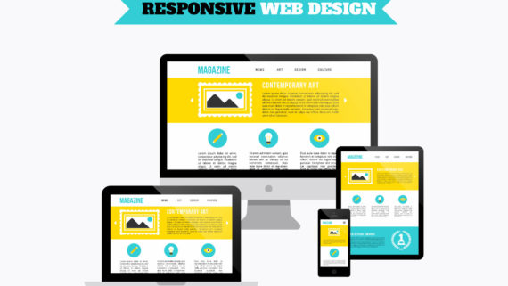
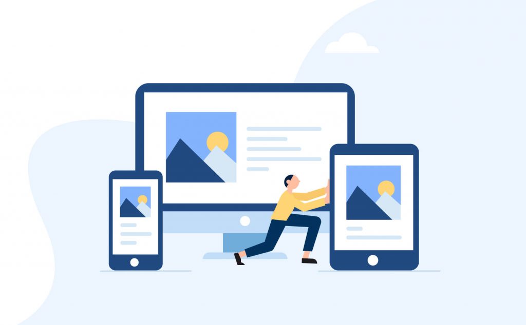
Now, how can one access a website from different devices of different sizes? This was a challenge but the options that are available in present times are “Responsive Web-Design” and “Adaptive Layout”. The topics we will discuss surround these two.
Now, you have a website and in order to gain major popularity you need to break its device barrier. Now among these two options which one should you choose and why and exactly what are these two options.
Let’s discuss one by one.
- WHAT IS ADAPTIVE LAYOUT?
Well, you can quite guess what it is going to be. It definitely is something related to the reorientation or resizing the website.
Adaptive layout is the option that came into existence at first even before responsive website.
Adaptive website helps you to design three different layouts of your website for three different device sizes.
Adaptive layout does not add up to the existing website. It is like designing three different website keeping the content same but rearranging and reorienting it to fit it up in the given space. It is mostly use when you know what kind of devices accesses your website. It does not gradually change its shape to fit. When you open it with a device it will automatically choose one of its orientations that fits on your device but that does not mean it will cover all your screen space. It will only be able to orient its shape into one of the three arrangements.
So, this is what adaptive layout is and how it works basically. This may be your pick while trying to overcome device barrier.
- WHAT IS RESPONSIVE WEB-DESIGN?
We know that it is something that really helps in fixing the problem of device barriers of the website. Responsive Web-Design is something that helps the website to fit on any required device. It helps the website to rearrange itself depending on the device in use. Nowadays even the smartphones are diverse, so it is something really really helpful. It basically uses CSS for its purpose. It’s definitely a good choice to pick. It is probably the best choice available presently. It came into scenario after the adaptive layout. The only drawback it has is that it is a bit costlier than the adaptive layout and that it really becomes a problem to use responsive web-design when the website contains images. Images are something that really poses difficulty in case of reorientation, it delays the loading time. But somehow CSS manages the problem somehow. Thus responsive websites are a good alternative in the present time where there is so much difference in the size of devices.
- WHICH ONE TO CHOOSE?
It is up to you that which one you will choose. Both are good, but the choice completely depends on specific factors. If you know that some specific devices access your site and that would be enough then adaptive layout is probably a good pick. And if you want your website to fit on any possible device size then no doubt responsive website is your choice. Your budget also decides a lot. If you are not sure about any of these but have a high budget then responsive website is best for you, because definitely it is the best option as adaptive layout cannot fit any size it can only take some specific orientation no matter what. So, it depends on your choice and your requirements that which one you need. So, search a bit for exactly what you want, how much money you have to invest and what can be the consequences. And then ultimately choose one.