In present times people no more live in a society filled with living organisms but in a world full of tech stuffs and machines. Basically nowadays the world is under the rule of technology. This basically is the age of information technology. One who can’t live with it will face severe problems and one who adapts it will get the ultimate ease of life. It is still developing each and every day. From very small detail facts to big articles and information we use the present time benefit called “Internet”, and it consists of building blocks called websites.
Websites vary on the basis of its use and purpose. Websites are there for several purposes, some for E-Commerce, some for Information Library, etc. Different people use it for different purpose. When you search a specific stuff in computer you can see a big number of websites is shown just below the search bar of Google. This shows how many website are there. So, basically for every purpose in our life we use the source called website.
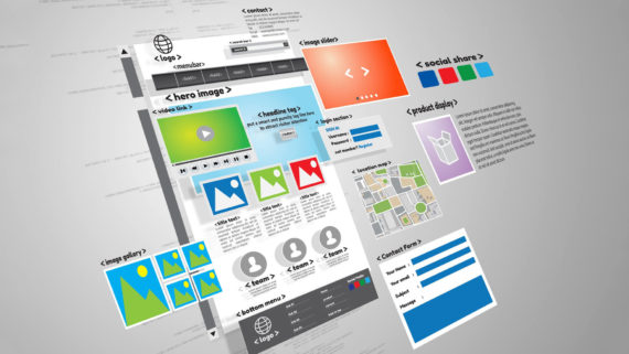
Well, the people who make websites are familiar with the term called UI (User Interface), it is something which decides the success rate of your website, and you can read about what exactly is an UI in other articles, well there is a very important element in an UI called Typography. It comprises of a huge part of the UI of a website, thus it is a very important component that web-designers must focus on carefully in order to design a successful website with a unique and highly appreciable UI. Well, today we are going to discuss about this element of great priority called Typography.
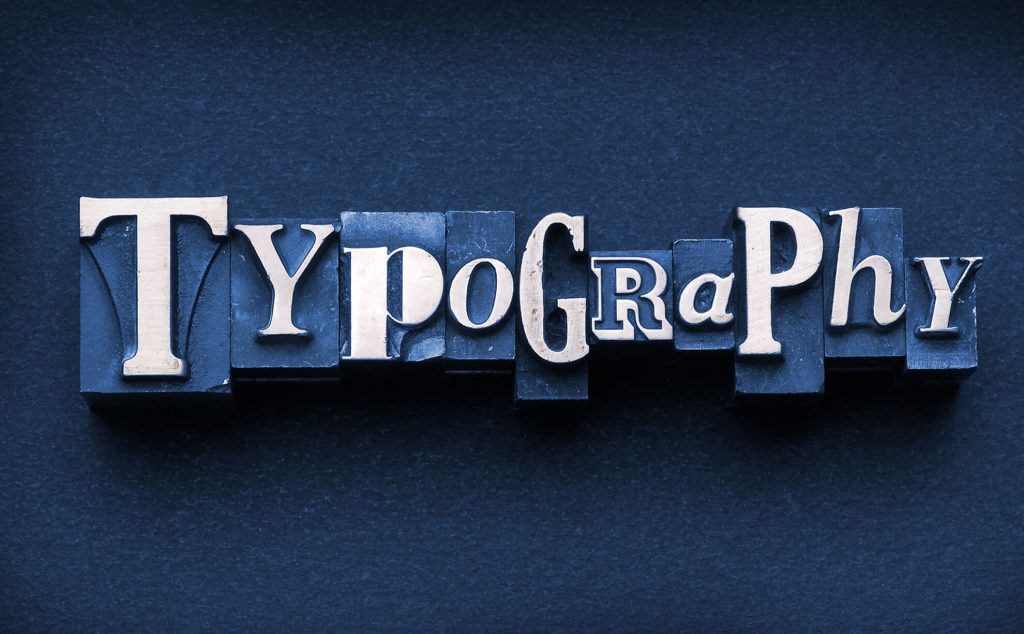
WHAT IS TYPOGRAPHY?
Well you could guess a bit about it by its name, right? So, basically the typography of a site means the written or text component of a website, like heading, sub-heading, footer, content, etc. Well it is not only about the written content it is also about the specifications of the text, such as its size, color, height and several other detailed factors. Typography basically comprise of the whole written stuff, its arrangement, its specific details and its effect. So, you must know that in most of the websites, the maximum part constitutes of written document. No, website is there without any text part, more or less in all websites there is written part, and that plays an important role in the UI of the website, A person gets highly affected by the typography of a website, and thus it can bring huge success rate if used carefully and can cause adverse effects if not taken care of. A site with poor typography will definitely face losses no matter how good its content is. Even the sites having minimum text also needs good typography. Because, for instance when you first visit a website what do you first see? Of course the logo or the heading of the website, which is a part of this typography. So, it is now quite clear that typography is an undeniable highly important element of the UI of a website. And in order to thrive to success you need a really good typography, so how can you do it?
STEPS TO BETTER TYPOGRAPHY:
Now that we know that typography is worth some important discussion, we shall point out 10 very important steps in building a perfect typography in order to boost your UI and thus push you towards your path to success.
1. SIZE
This is something highly important in typography. The size is not only a basic factor but also a differentiating factor, like big oversized headings contribute to a better UI as bold oversized headings look good, but on the other hand the content or the other factors are of comparatively smaller size. Basically in a website you easily separate the heading subheading content easily, why? Mainly because of the different sizing of the text. Thus, size of the text is indeed a decisive factor. So, size of the fonts must be looked after and properly used as per requirement and placing.
2. LETTERFORMS
Having clear letterform is also highly important. Have you ever noticed that sometimes the Uppercase “I” and the lower case l looks the same and can be confused easily? Similarly, people also confuse consecutively written r and n with the letter m. So, this confusing font style and letter forms can really break a good flow of a reading and that can really cause some problems to the users of the website. So, having clear and differentiable letterforms are highly important, because non differentiable letterforms can form problems. So, this problem must be taken care of.
3. HEIGHT
Well, it is quite known that most of the texts we go through in a website are lowercases and it of course will be better if the difference between uppercase and lowercase letter is clear. The main differentiating factor among lowercase and uppercase letters is the height of the letters, thus having a properly prominent difference of height between uppercase letters and lowercase letters would be highly appreciable.
4. COUNTERS
The white hollow part inside the letters O, U, etc. are called counters. So, if the hollow part inside the letter o is very big with a very thin outline it will be inappropriate, as well as very wide borders and very less counters will also be highly unacceptable. Thus this small detail also affects the typography of a website. Thus, proper counters is also important.
5. WEIGHT OF TEXT
Well weight is basically the width of the words and letters in a text like the difference between “this” and “this”. So, very heavy text is not a good element in typography as it is very problematic to read very thick font style as well as too much light font will give a weak and uncertain feeling. So, a proper weight of the text is highly important in order to achieve a perfect typography.
6. WIDTH PROPORTION
Actually width proportion refers to the ratio of the width of a letter to its height, generally wide letters are a bit better recognized by users thus it can contribute towards a better typography, but it should not be too wide. Thus, having a proper wide proportion will definitely benefit you UI.
7. SPACING
We come to another highly important part of typography spacing between words. Well, in childhood I had a very bad habit of leaving very less space between words thus making it difficult for my teachers for reading and it really caused a bit trouble. So, having proper spacing between the words is also required for proper and fluent reading of the text. Thus, in order to achieve a better typography this factor must be properly looked after.
8. READABLE TEXT
Now, you will obviously expect a proper and an easily readable text in a website. No one has the time to read your text if they are hard to read or not properly arranged. Of course no one has time to waste in decoding text, thus if your site’s text is not very easy to read then it might increase your site’s bounce rate. Thus, it is very important to maintain the fluency of the text by making it easily readable.
9. WHITE SPACE
Now, this is something that many designers ignore but in practical white space or negative space is very important this gives a highlighted look to your text thus increasing its effect and attractively. So, white space can bring out some huge differences thus proper and clever use of negative space can really cause wonders.
10. HIERARCHY
We know about visual hierarchy right? Well typographic hierarchy also contributes to it and thus is a highly important part of UI. Maintaining typographic hierarchy is extremely useful. Like using the “Z” and “F” rules in hierarchy and stuffs like that. Typographic hierarchy makes a user read it and makes it more magnetic that users will unknowingly get attached to it. And this definitely can bring out great results.
Well, this were some golden rules that can definitely improve your typography and thus your UI. Always remember typography is UI. Never ever ignore the typography because it is something worth your attention.