
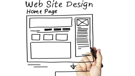
What is responsive web design?
Let’s say you are owner of an e-commerce website providing books online. You were doing good until there came an incredible number of devices in the market like Desktops of various size, Smartphones of different resolution, Tablets, Laptops and even Smart watches! You noticed that all these devices have brought about a revolutionary change in the way people ingress information available online and look up websites. Earlier desktops and laptops were popular but today mobile devices rule the market. The traffic on your website decreased due to website’s inability to adapt layout to the size of the viewer’s screen. So, the question arise how can we ensure that experience is consistent for all the devices? Let’s say, for instance, you can think about building various versions of website for different size of devices, but it is practically not possible to build a website version for each resolution and each new device.
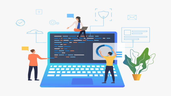
That’s when the concept of Responsive web design came into action! Responsive web design makes your web page look accessible on all devices irrespective of screen size. the need for serving up a separate stylesheet for each device gets eliminated by Responsive design. In simple words, the responsive web design is a technique of designing websites in a way, which allows you to adjust the content at any resolution and size of the screen on which you are browsing. Its main aim is to artifice site to give experience in such a way that website looks same on all devices to the viewers. And this experience is created by using flexible images, grids that are proportion-based and CSS media queries.
What difference does it create?
Different elements which when viewed on devices of different sizes, respond differently. So, a traditionally fixed website, which when viewed on a smaller tablet, might compel you to scroll horizontally or even vertically, or certain elements might be hidden from view or they may look distorted or images may take a lot of time to load which, is what the users don’t like. Now imagine what happens when they access websites in landscape mode or portrait mode? We understand this and that’s why we, being a website development company, when say we strive to be your technical partners and not just website designers and developers, we really mean it.
Viewer’s decide whether to stay on the website in a couple of seconds of surfing it and if the content is not optimized, their first impression may ruin.
Visitors do not like to wait on website for contents to load or to manually fit the size of the device they are working on.
Also, in this era of smart phones, internet traffic is expected more on phones than that of the desktop computers. People tend to jump from one website to other very often and that’s when Responsive website work magic.
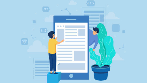
How does responsive design work?
Rather than pixels, responsive sites use fluid grids. All page elements are sized by proportion. So, let’s say for rows, you would define how long they should be in relation to the other rows, rather than how wide each should be. Media and elements as in images are resized relatively too, this way any image can stay within its column or relative design element. Awesome right?
What are the benefits of responsive web design?
Not to mention the obvious one- you can expect heavy traffic from gadgets of different sizes, you can also convert visitors to customers!
Here are some other benefits of responsive design-
-
Saves a lot of time and labor-
Imagine if you had to create different websites for different devices every time new screen size comes, how much time and labor you are saving with responsive design!
-
Only one version site needs to be updated-
Whenever you are thinking of updating contents or adding elements to your website, how many times you’d have to do it if you don’t have responsive design?
-
Higher Google ranking-
How can this be missed? Every firm wants top google ranking whether they are trying to rank locally or nationally. Here is an interested read about optimizing websites for local search. Making a responsive site gives the site a higher ranking in Google search. Higher rank is very important for every business to not only grow but sustain in the competitive internet. It helps the search engines in order to gain more traffic and valuable primacy. A single URL optimizes your site for SEO purpose also. Also, one URL makes it easier for the end users to interact with your site.
-
Savior from duplicate content penalties-
Looking on the top of search listing is what everyone struggles to get, and with responsive web design you can achieve this. To understand this better, if you build different versions of website google may inflict your punishment for having duplicate content and make you look like a spam.
-
Improved SEO-
how can we miss this? When you create different websites for different devices it becomes difficult to use SEO because of different URLs in different websites. We know your needs and that’s why we, a website development company based in Gurgaon give you get SEO, responsive web design and graphics designing under one roof!
-
Economical-
Of course, building responsive websites is going to cost you but not more than making different versions of it. Creating different versions is going to cost you much more. Responsive websites save you from building different versions for different devices. In case if you want to update, change or alter the contents of the website later you just have to make change in one site and not all and yes, this is going to save your time, money and efforts.
-
User friendly-
Great experience to the users is what Responsive website promise. They get the convenience of viewing your site from any device and still get a browsing experience which is to the point. Satisfied users are likely to engage more on your website. Happy users and customers give good reviews and ultimately it leads to more traffic, brand image boost up, higher sales and more profits.
Here is a video explaining the same