Well, honestly speaking most of my time I spend on the Electronic Medias either PC or Mobile. Well this is 21st century, speaking frankly each and every person nowadays requires some electronic media, it has become necessary. Not a person moves from their place for anything nowadays in the era of internet. You can almost do anything with just a click, but even now its developing each and every day for even better experiences and these changes has been quite drastic, because no one knew about such advancements a few decades ago and just within this time there have been quite huge developments. Even small children nowadays can use mobiles and computers with great ease and smoothness. So, it is quite clear by the scenario that nowadays there is a great demand of technological development.
To be specific, there has been increasing need of websites and better web-design and advanced UIs. Honestly, Internet rules the world presently but website is the actual component that acts as the results to the users so it is the component that matters the most and it is undeniable that websites are developed and get advanced each and every day. Programmers and big companies from all over the world work hard in making better websites.
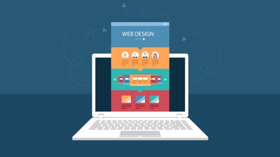
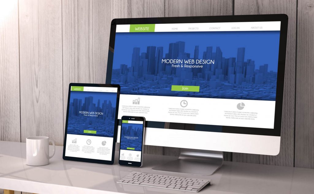
Well, today’s topic is about one of the most discussed and hot topic in today’s web-design market- “RESPONSIVE WEB-DESIGN”. Well very few people are aware of this topic but it is one of the most important issues nowadays.
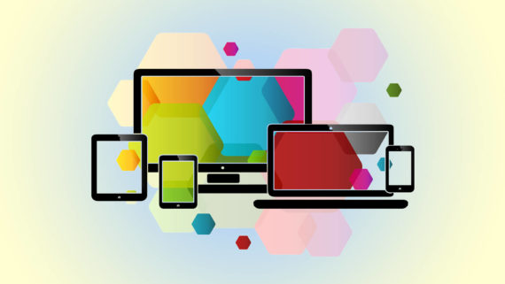
Well by research it has been found that almost 66.77 % of world’s population uses smartphone and honestly, it is something really big, that such big percent of total world’s population is not a quite small thing. Well once Google proposed a strategy called “Mobiles first” where they would prefer websites that work well in smartphone than any other interface. Well, this device variance is what this idea Responsive Web-design deals with.
WHAT IS RESPONSIVE WEB-DESIGN?
Well, most of the world’s population uses smartphone so, it’s obvious that it will be the most highly targeted device; now responsive web-design actually refers to web-design which enables the websites to work equally & efficiently in all of the mediums without any problem. Well it focuses on designing the website in a way that whether you open it in a PC or in a smartphone or in a Tablet, it will work in all of these with equal efficiency, this is what makes it such a hot topic nowadays, there has been a huge variation of device sizes nowadays, there are various sizes of devices today and Responsive Web-Design is the idea that makes it possible to make the websites available in all kinds of devices and it is something highly needed. People don’t have time to stick only in one device, so there requirements must be met in any kind of interface so, basically it is what Responsive Web-Design deals with.
REQUIRED FEATURES OF RESPONSIVE WEB DESIGN
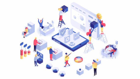
Now, we know what exactly a Responsive Web-Design is. Now, what are the features that build up the idea of Responsive Web-Design or what does this Responsive Web-Design consist of? Well, according to experts there are some key features of Responsive Web-Design. Basically these features build up the required website facility and enable us to use websites on any device.
Now, according to developers and experts these elements or features are:
1. FLEXIBLE GRIDS
Well, the definition of grid is not anymore fixed to limitations. Grid nowadays is the controller of the arrangement and orientation of elements on the basis of the size and type of device.
Opportunity to define your own column, spacing and other orientation stuff is the best possible facility that a web-designer can get nowadays for creating a Responsive Web-Design. And it is all now possible for the flexible grids system. Now due to the flexible grids the website and its layout can arrange themselves in any parameters depending on the size of the device. So, layout and grids is no more an obstacle for building a Responsive Web-Design.
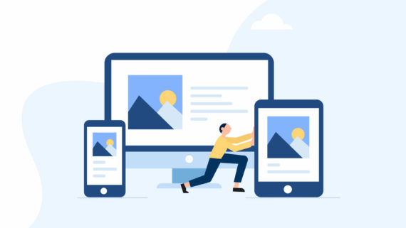
2. FLEXIBLE IMAGES
Loading huge sized images that are later scaled down by parameters is not very preferable for fast loading of a website. Images have always been a huge problem for Responsive Web-Design. Images are really hard to limit in size and it also affects the loading time adversely. So, the image is a very problematic issue in the way of Responsive Web-Design. So, web designers found few ways to control that problem. Like one of the available choices is the process of cropping the image by the use of CSS and hiding the rest of part to increase the space for content of the website, this has given a rise in the demand of CSS in a great way. Thus the CSS has come to great use in the process of Responsive Web-Design. The other possible way to satisfy the need of space for text content is to hide the image and orienting the text of the site in place of it to maintain the parameters of the device. This is also done with the help of CSS, at first the image requirement of the website is seen and the non-essential parts are hidden. Thus, these are the till now available choices that contribute to the process of Responsive Web-Design.
3. MEDIA QUERIES
Well many people are unfamiliar with the term Media Queries, but often the web-designers think of this as the core or most essential element for Responsive Web-Design but actually it isn’t a media query is not much useful without the help of extremely strong bond CSS, well media queries of course is an essential component. Media queries actually is a CSS module that allows the website to adapt the screen resolution. Well the arrangement or the adjustment of resolution with the changing device has also been a challenge on the path of Responsive Web-Design, well Media Queries is something that helps to clear up that problem by helping websites to adapt to resolution changes and thus helping Responsive Web-Design in a great way with the help of CSS.
Thus, it is now quite clear to us that Responsive Web-Design is something extremely essential in our present scenario where every person uses different kind of devices. And with the growth in the variation of devices a variation adaptable web-design is also required, so this helps us in fulfilling that motto. And no-doubt it is still developing and it is to wonder what comes in the coming days